px vs em vs rem vs %. Which one do I use while designing web pages?

There are more than a few units to size an element using CSS. You might have wondered which one to use. let me help you choose the right one for your needs.
Difference Between PX, EM, REM, and %
let me make it simple for you:
16px = 1em = 1rem = 100%
If you are here to know about the conversion formula. 16px is generally the base size, and I’m considering 16px as the base size here:
pixels to convert ÷ 16 = em
For example, If you are willing to convert 40px to em and the base size is 16px then:
40÷16 = 2.5em
Now If you are still with me probably you want to learn about the core differences between these two.
Core Difference:
I will talk about rem later in this blog, for the time being, consider em and rem as the same units. So basically, px is a static unit but em, and % are dynamic units, let us understand this by an example.
Let me create an index.html file and link it with a CSS file
I will define the size of the text in the paragraph tag in pixels using CSS.
.container {
  padding: 40px;
}

p {
  font-size: 20px;
}
and the output looks something like this:
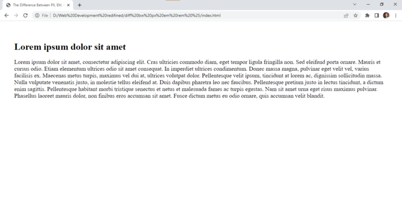
Now let’s head over to the chrome://settings/appearance and change the font size to very large.
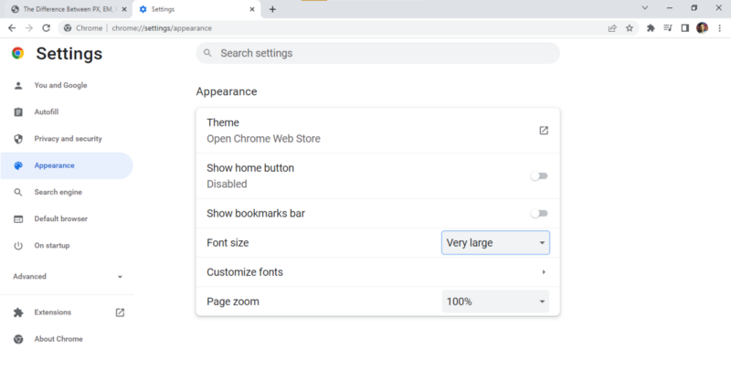
Now you will notice that the size of the Paragraph tag is not increasing even if we change the default font size and this is because pixel is a static unit and it stays as it is until we zoom in on the web page using Ctrl and +.

Did you notice something unusual? I can see something changing its size. Oh! it is the h1 tag, now all this is happening because the size of the h1 tag is pre-defined in em, and as I told you em is a dynamic unit.
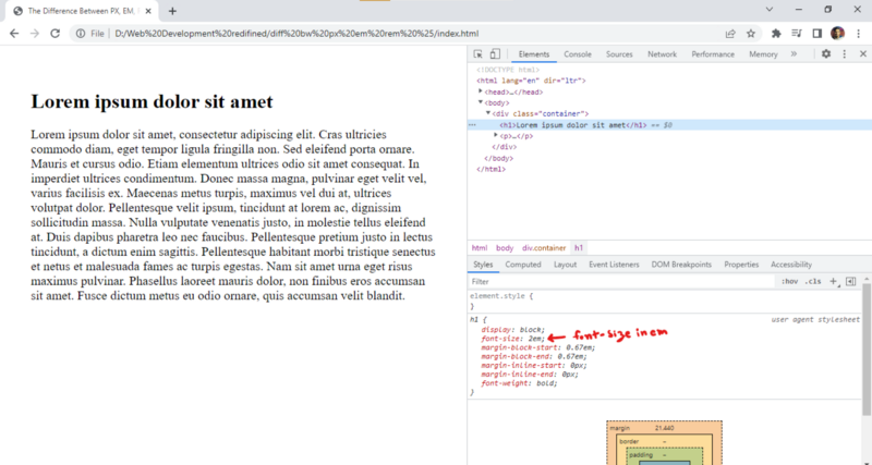
It is considered better to design your website using dynamic units as it helps people with visual impairments to scale up the text and makes your website much more reliable. % is also a dynamic unit. Which one you will use? well, it is up to you now.
What is rem?
Let me be quick. Let’s take an example:
index.html
<!DOCTYPE html>
<html lang="en" dir="ltr">
  <head>
    <meta charset="utf-8">
    <title>The Difference Between PX, EM, REM, %</title>
    <link rel="stylesheet" href="css/styles.css">
  </head>
  <body>
    <div class="container">
    <p>Lorem ipsum dolor sit amet</p>
    </div>
  </body>
</html>
css/styles.css
body {
  font-size: 2em;
}

.container {
  padding: 40px;
}

p {
  font-size: 3em;
}
In the above example, we have defined font size as 2em for the body and 3em for the paragraph tag. Now the sum of 2em and 3em is 5em and this is what is gonna be displayed on the web page.
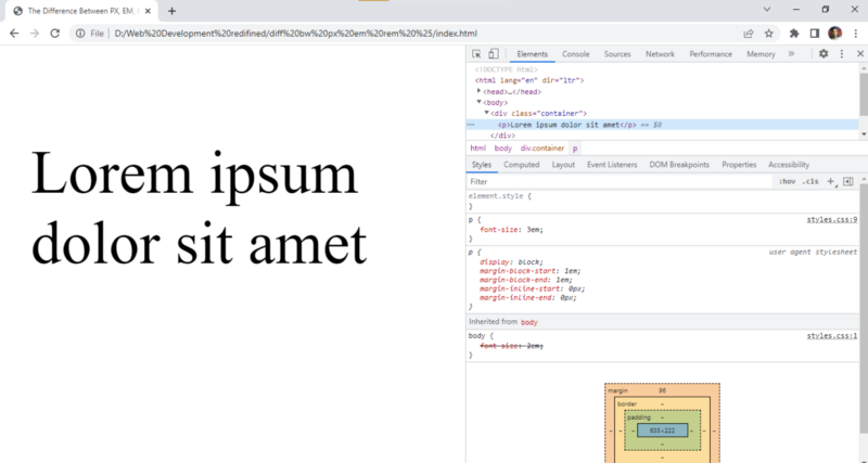
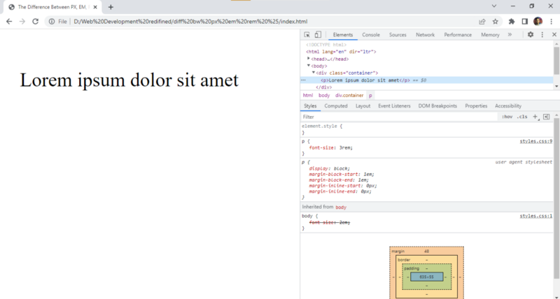
Even though the 2em is crossed out, it still applies! making it a total of 5em.
so, rem stands for root em, and using rem we can override the size defined for the body instead of inheriting it.
body {
  font-size: 2em;
}

.container {
  padding: 40px;
}

p {
  font-size: 3rem;
}
After making the above changes the paragraph will have a font size of 3em only.
If this article was helpful please consider following me on GitHub and subscribing to my newsletter. Your appreciation is my fuel. Namaste guys🙏.


